
Asymmetrical Venn Diagrams
- Aug 20, 2020
- 2 min read
Asymmetrical Venn Diagrams are my new favorite tool to pictorially demonstrate interconnections of a variety of concerns with complicated situations/problems. The aim is to reduce uncertainty, demonstrate part-worth magnitudes, and the overlap of different areas with an overarching issue. Issues like Climate Change, Covid19, Economic Health, and others are not tidy confluences; these areas and others need tools that are not limited by their simplicity. Sometimes Simplicity fails to convey the import of the most concerning impacts by levelizing all the graphics for unrelated reasons. Sometimes a scatter plot is used to help to visualize locuses of varied inputs/outputs of a complicated system. However, this suffers from the same problems as traditional histograms. The only relative of Asymmetrical Venn Diagrams are Word Maps that visually convey the frequency/importance of the vocabulary within the context of a long(ish) document.
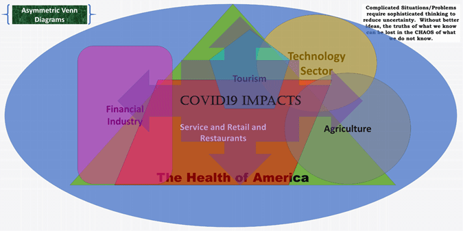
From this Diagram, The Health of America is the triangle within the context of Earth (likely exaggerated compared to the rest of the world's impact on global GDP). However, the intent of the author is to show how the different areas impacted by the Covid19 virus are Agriculture, Technology Sector, Tourism, Financial Industry, and Service and Retail and Restaurants. From the position of the author, Tourism and Service and Retail and Restaurants are intensely impacted by Covid19, whereas Agriculture, Technology Sector, and Financial Industry are much less affected by the impacts of Covid19 because they have strong relationships with revenue sources independent of the Health of America.


Comments